User interaction is the main reason behind combining colors in web design. We want to entice people to stay longer, interact with content, and respond to calls to action.
Colors can affect everything in your website design, from your brand personality to symbolism, to your message’s intensity. The right color tones can engage the human senses and create a spontaneous connection between the user and the brand.
Colors convey emotions, send intuitive messages, and add radiance to a website page. The psychology behind color pallets is a fascinating subject. Humans love colors. In fact, over 90% of the assessment of a website is done on a subconscious level based on color impression.
Colors have a direct effect on our emotions. They have the ability to generate a positive impact on a web visitor and as a result, create higher conversion rates. Designing your website in a particular hue can help create trust, overall appeal to a particular target market, and even affect users’ decisions of whether or not to buy a product.
Using color remains a leading tool to trigger specific emotions. Choosing an appropriate shade combination is a crucial (yet often overlooked) element in creating a successful website design. Your colors can function as both an organizational instrument as well as a personality drive.
As a general trend, more and more designers are pushing to work with brighter tones, partly because there are more choices available in the web color spectrum. Using vibrant shades is a trend that will persist in overtime. Bright colors have the power to shape great user experiences. Think of buttons, calls to action, page backgrounds, and image shading. Using bold and dynamic tones adds a whole new dimension to a page.
At Badger, we love experimenting, blending colors, deepening them, or spotlighting vibrant elements against dark backgrounds. But what do specific colors say, and how can you use them to your advantage?
GOING GREEN
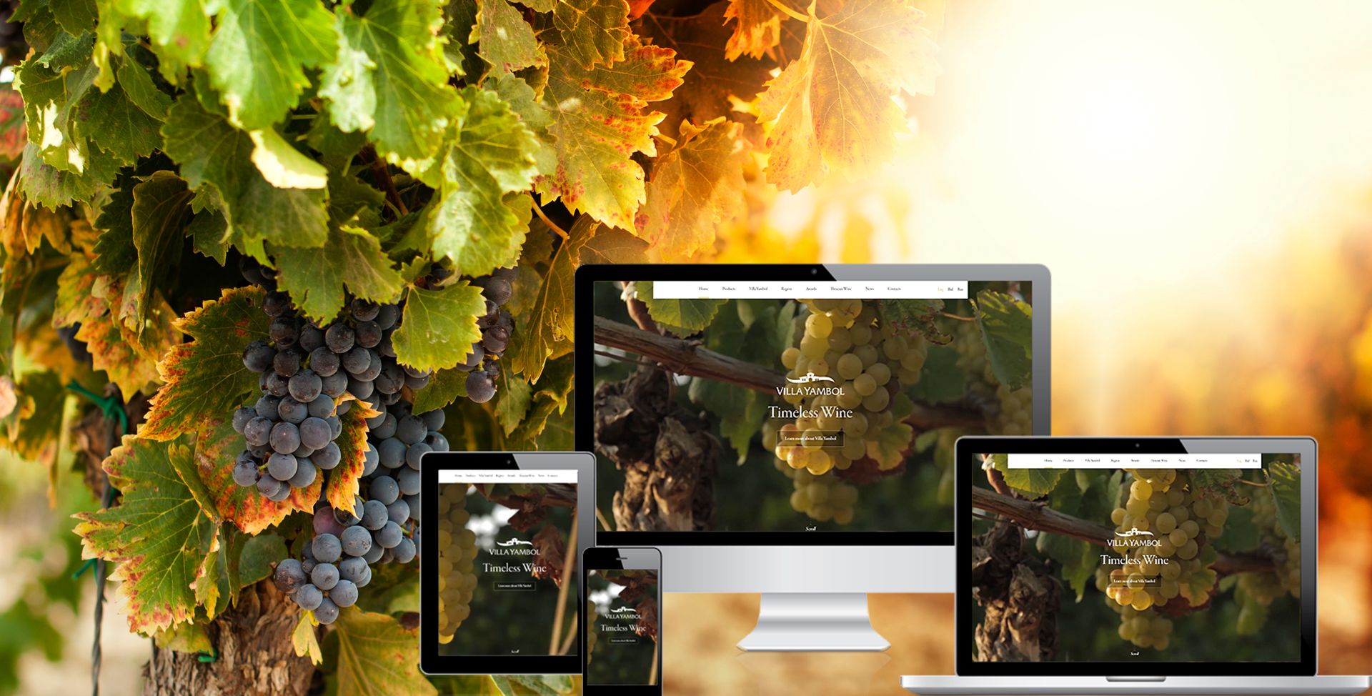
In the example below, using green, comforting shades brings an emotional appeal to the page. No need to be a wine lover to appreciate a stroll along the lush vineyards. The design accentuates the earthy colors of the valley, creating an almost romantic affair between the viewer and the brand.

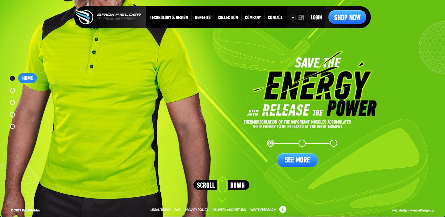
Green, combined with golden tons and luminous hues, has the power to create a feeling of energy and vitality that gets people excited about your brand. If your content is about being active, get off the couch, experience the outdoors, or promote an active service, bright green and gold are colors you should test. This is a color combination that appeals to both male and female clients.

OPPOSITES ATTRACT
Contrasting colors at the opposite ends of the spectrum create visual harmony for the eyes. Combinations of blue and orange, red and green, purple, and yellow raise the energy feel, making a website look more alive and strong.
Vibrancy dictates the emotion of your design. Brighter colors leave users feeling more energetic, while darker shades tend to relax people allowing their minds to focus on other things.
Below is an example of a darring website. In order to capture the dazzling nature of fireworks, our team designed a kaleidoscope of colors and animations. Our mission: create a fantastic, whimsical experience that makes people smile. The color layout is constantly updating itself, creating unpredictable illusions. This is an extreme example of using opposite bright colors, but people stick around and explore more than any other website.
FIFTY SHADES OF BLUE
A monochromatic scheme consists of using one single color in different tones and brightness. Working with your leading brand color in different shades can be very effective, soothing, and authoritative.
In this example, the web design explores Adright’s tones of blue. Blue typically conveys credibility, focus, power, “business-like”. Adding a bright layer over images or video backgrounds gives additional excitement to the design. The bright color catches the user’s attention, while the image or video below the layer delivers further information.
Here is another example using blue shades in the website of BCB Community Bank.
A reason why blue is such a popular color among corporations is that nearly everyone can see blue or distinguish blue as a color different from others. While reds and greens are difficult to see for people with color-vision deficiency.
HOP & SKIP THE COLOR WHEEL
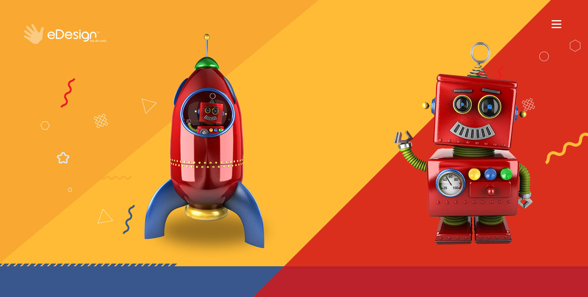
This style of web design includes a main color and the two colors one space away on each side of the color wheel (split-analogous color scheme). Below is a great example of how bright colors can be used to create a childlike atmosphere.

Red is a stimulating and exciting color, often being associated with passion, power, determination, and boldness. However, it can also mean danger. If red is not properly used, it can have an overwhelming effect and scare users away.
THE ABSENCE OF COLOR
Black is a very strong and powerful tool to express your business personality. Black is associated with strength, credibility, power, preciseness, professionalism, directness, and accuracy. Black and white is a fabulous combination made of timeless elegance, balance, and simplicity.
Agata Photography is a great example of striking web design based on black and white. The red color in the design is there to remind the viewer of the red line marking the focal length of a camera.
High-resolution images and vibrant colors continue to dominate the web design landscape. Great websites use contrast to reduce eyestrain and focus user attention on the elements on a page. Your colors and shades build the look and feel of your brand online and can be applied to increase user engagement.
Let’s choose your colors together! Ask us for advice at hello@edesigninteractive.com.
