

Locally grown in Texas, Hardie's is a family-owned fresh food distributor making daily deliveries of fresh produce throughout the southwest. The company has been providing farm-fresh fruits and vegetables, dairy, spices, and organic items to foodservice establishments and retailers since 1943. From seed to fork, Hardie’s prides itself on the highest standards of food safety, security, quality assurance and HACCP standards.


A renowned business with solid traditions, Hardie’s needed a modernized image while still conserving the spirit the brand was built upon.
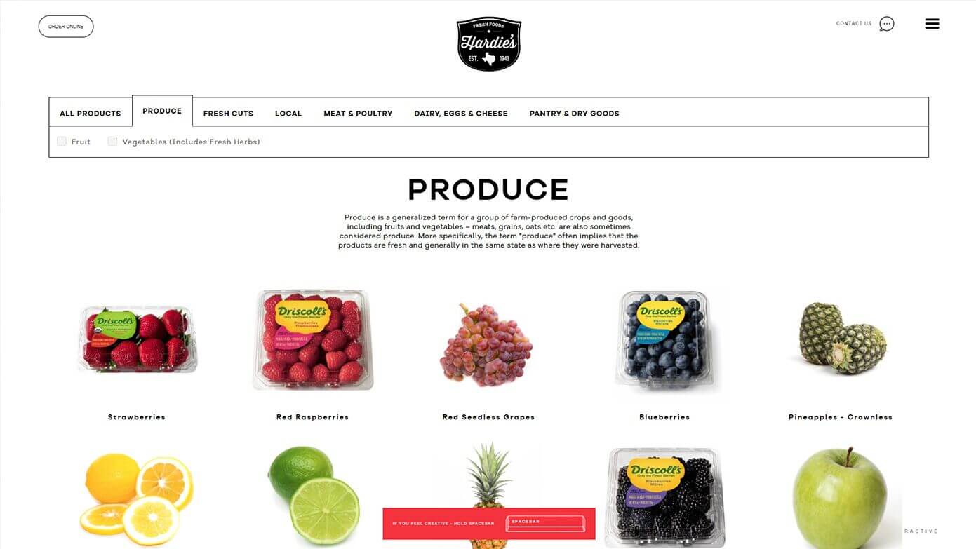
Our team designed the Hardie’s website to serve two main functions. Part of the site houses corporate identity, history, values, and work ethics, while the rest of the site highlights the brand’s product catalog and features its impressive array of in-season produce.
Art Direction, Graphic Design, User Experience, Project Management, Hand Drawn Illustrations, Animations, Front and Back-End Development, User Interface Design, Photography Manipulation, 3D Design.

To add an interactive cool factor to the Hardie’s site, we created a dynamic wheel showcasing all the fresh fruits and veggies currently in season.
We even added a “draw it yourself” product search, where users can use their fingers to draw the shape of a fruit or vegetable in order to let the website determine the product in question. To match users’ hand-drawn doodles with real products, we used the latest artificial neural networks (ANN) technology.
We’re using artificial neural networks (ANN) to identify hand drawn images of fruits and veggies. What is ANN? It’s a computing systems inspired by the human brain. The network itself is not an algorithm, but rather a framework for many different machine-learning algorithms that work together to process complex data. In Hardie’s website, we use the power of ANN for image recognition. We have given users the possibility to manually draw the shape of the product they are looking for. Our machine intelligence matches the hand-drawn doodle with a real product.

We researched Hardie’s business story in detail to understand brand’s essence, core mission and market position. This discovery phase inspired our team to imagine fresh new visuals for Hardie’s online space. We made sure to pay special attention to the sitemap, wireframes and content layout, as we knew user experience was key.
The site makes it easy for visitors to find products, search the online catalog, or filter fresh cuts. This ease extends to the back-end as well, with an intuitive dashboard that lets our client easily swap out products or spotlight seasonal fruits and veggies.

During World War II John Hardie purchased a single farm-to-market delivery truck to fill a much-needed service in wartime Dallas. Three generations later, this simple service has blossomed into one of the premier fresh food distributors in the southwest. Connecting chefs with quality fresh produce directly from local farms is a fantastic concept.
Today, Hardie’s is still family-owned and applies the same historical values of hard work, innovation and genuine service. We are proud to work with a company, which values a healthy lifestyle from farm to fork.
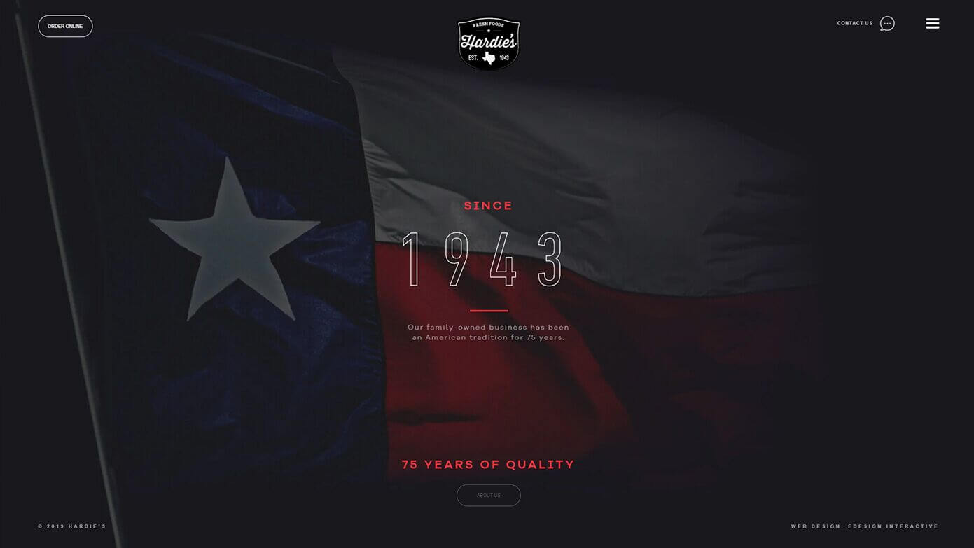
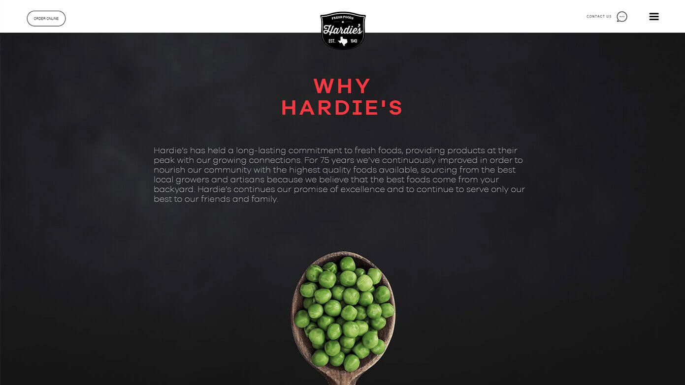
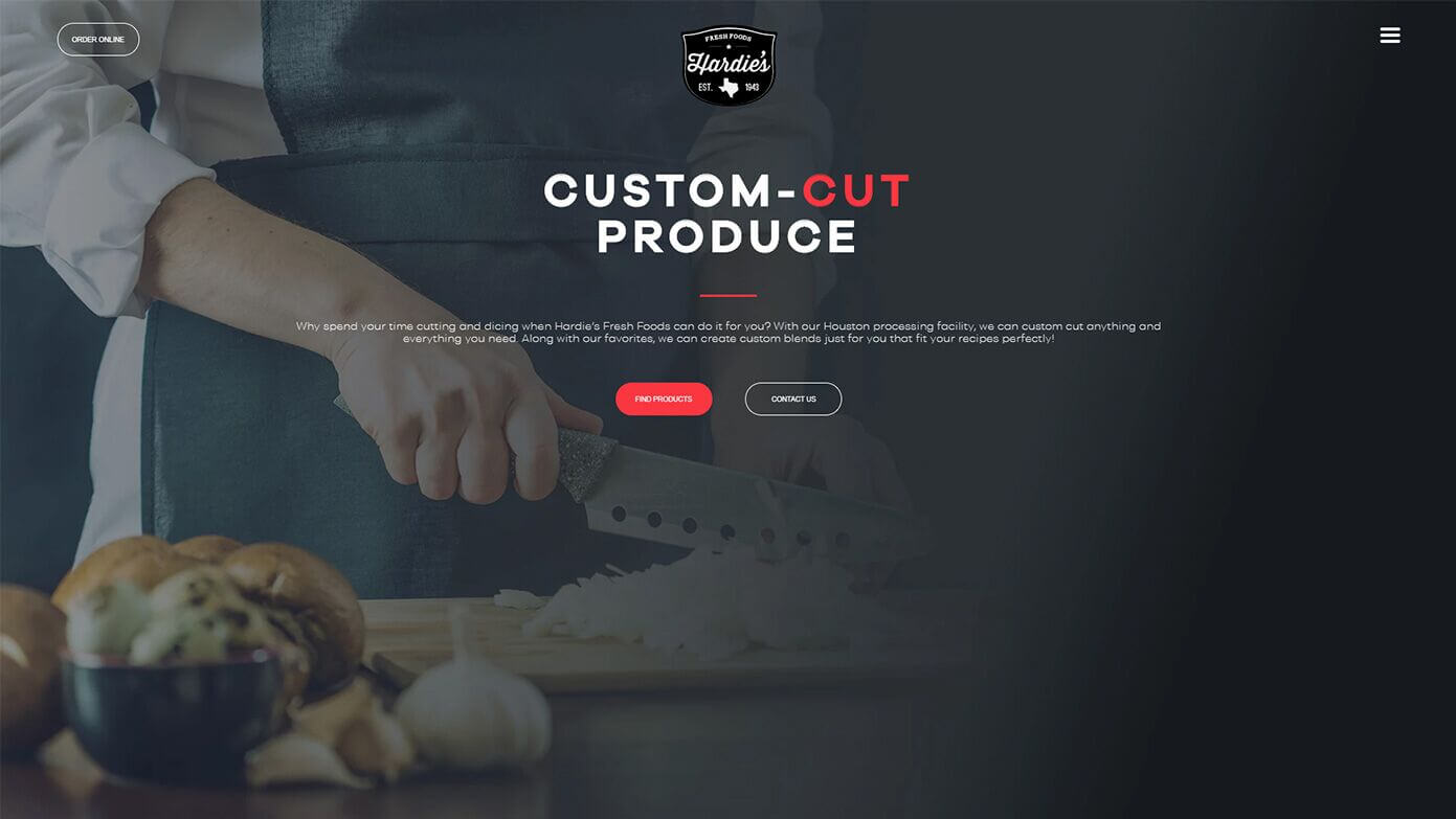
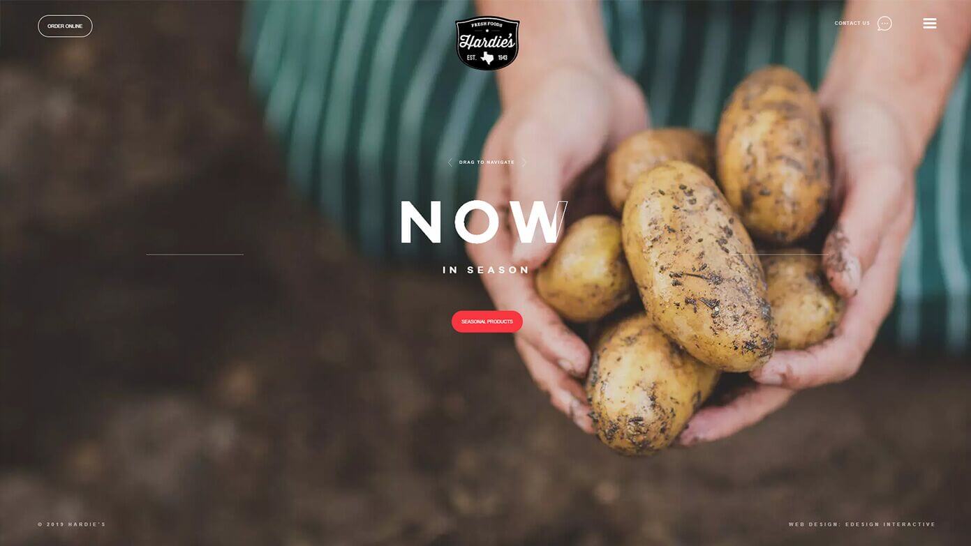
We wanted the Hardie’s digital space to be interesting to read, with catchy phrases to grab the user’s attention. To accomplish this, our team “freshened up” the site content with simple yet striking headlines and display copy.
More
projects
We use the power of digital technology to engage your audience...